

“ Despite being the pioneer mobile wallet app introduced in Pakistan, JazzCash did not gain widespread adoption among the population. “
JazzCash was introduced in Pakistan in 2012, but it faced low user adoption. In 2020, IBM and Systems Limited took initiative to address this issue. They assembled a design team of five members, and I had the opportunity to be one of the designers on this team tasked with finding solutions.
Use Cases I have worked on
Money Transfer
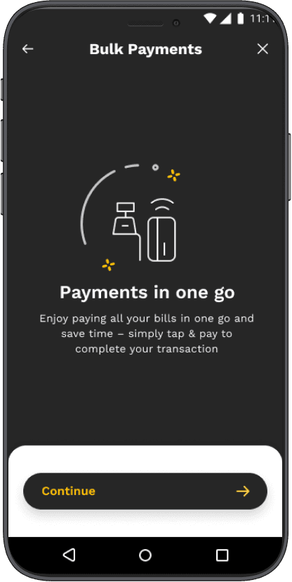
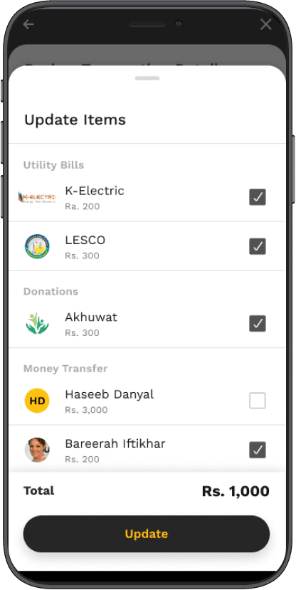
Bulk Payment
M-tag
Entertainment
Design System
->
->
->
->
->
How we found out the problem ?
What users says ?
15%
30%
What are the
frustrations of the users?
By empathising our users
Through different UX techniques we figured out the pain points of the users.
What user
feels?
The target audience ?
There were three personas who of using jazzCash
Old age people who can’t read and write
->
Tech-Savvy people
->
University going students
->


What people communicated on asking them their frustrations ?
We have conducted surveys with multiple users both consumers and merchants to find out their frustrations and painpoints
What they said? - some of the answers are below
“Flows are complex
and difficult to
navigate”
“App doesn’t
respond often”
“I don’t use
jazzCash
because its
difficult to
use”
“Flows are
lengthy”
“Icons are not
helpful”
“ I am unable to find support icon”
To initiate the redesign process, we conducted extensive user research to gain valuable insights into the requirements, aspirations, and challenges faced by JazzCash users. Our research began with conducting user interviews and engaging with a diverse group of JazzCash users to understand their current usage of the app. We also conducted online surveys with a larger audience to gather valuable feedback
“The existing JazzCash app faced challenges related to usability and user adoption. The complex interface and lack of user-friendly features hindered the overall user experience. Additionally, catering to a diverse user base with varying digital literacy levels posed a significant challenge for the redesign process“
The problem statement
The research revealed that users found the current JazzCash interface too complex, causing serious usability issues that significantly hinder user engagement. Furthermore, it was discovered that a significant portion of the user base had low digital literacy levels, requiring special attention in the redesign.
Competitors of JazzCash


We conducted a competitive analysis to assess direct competitors, examining features, design patterns, and user flows. By comparing our offerings to competitors, we pinpointed strengths, areas for improvement, and opportunities. This guided the redesign of JazzCash, incorporating successful design elements and features identified during the analysis
Strengths
Enhanced search functionality
Prominent "Add Cash" Call-to-Action (CTA)
Upfront display of available balance
Dropdown menu to select network for mobile top-up
Convenient one-click account hiding option
->
->
->
->
->
QR code scanning and sharing for hassle-free money transfers
->
->
Streamlined and Secure sign-in process
Weaknesses
Weaknesses
Content
Content
The icon used for cash points in EasyPaisa resembles a location icon, leading to confusion among users
The icon used for cash points in EasyPaisa resembles a location icon, leading to confusion among users
Important promotional banners are positioned at the bottom of the interface, requiring excessive scrolling and potentially resulting in users overlooking valuable promotions.
Important promotional banners are positioned at the bottom of the interface, requiring excessive scrolling and potentially resulting in users overlooking valuable promotions.
->
->
->
->
->
->
Absence of notifications feature
Absence of notifications feature
->
->
Limited number of features offered by Finca, providing only four functionalities
Limited number of features offered by Finca, providing only four functionalities
->
->
Lack of a feature to locate nearby Finca merchants, which could assist users in withdrawing cash from their Finca accounts
Lack of a feature to locate nearby Finca merchants, which could assist users in withdrawing cash from their Finca accounts
Utilizes a conventional and consistent language tone.
Utilizes a conventional and consistent language tone.
Clear and easily understandable language used throughout.
Clear and easily understandable language used throughout.
->
->
->
->
->
->
Incorporates a mix of graphical images and human-generated visuals to enhance engagement and comprehension.
Incorporates a mix of graphical images and human-generated visuals to enhance engagement and comprehension.
Design
Colors are not properly separated, and there is too much green (primary color) in the design.
->
The design doesn't feel crowded or messy.
->
The different feature categories are represented well and are easy to understand.
->
UX
->
The flows within the application are well-designed and intuitive.
The flows within the application are well-designed and intuitive.
Filters are not utilized in the application, making it difficult to refine search results or narrow down options.
Filters are not utilized in the application, making it difficult to refine search results or narrow down options.
->
->
The representation of features is not appropriately prioritized, causing confusion or a lack of clarity.
The representation of features is not appropriately prioritized, causing confusion or a lack of clarity.
UX
Design
Colors are not properly separated, and there is too much green (primary color) in the design.
->
The design doesn't feel crowded or messy.
->
The different feature categories are represented well and are easy to understand.
->
->
->
->
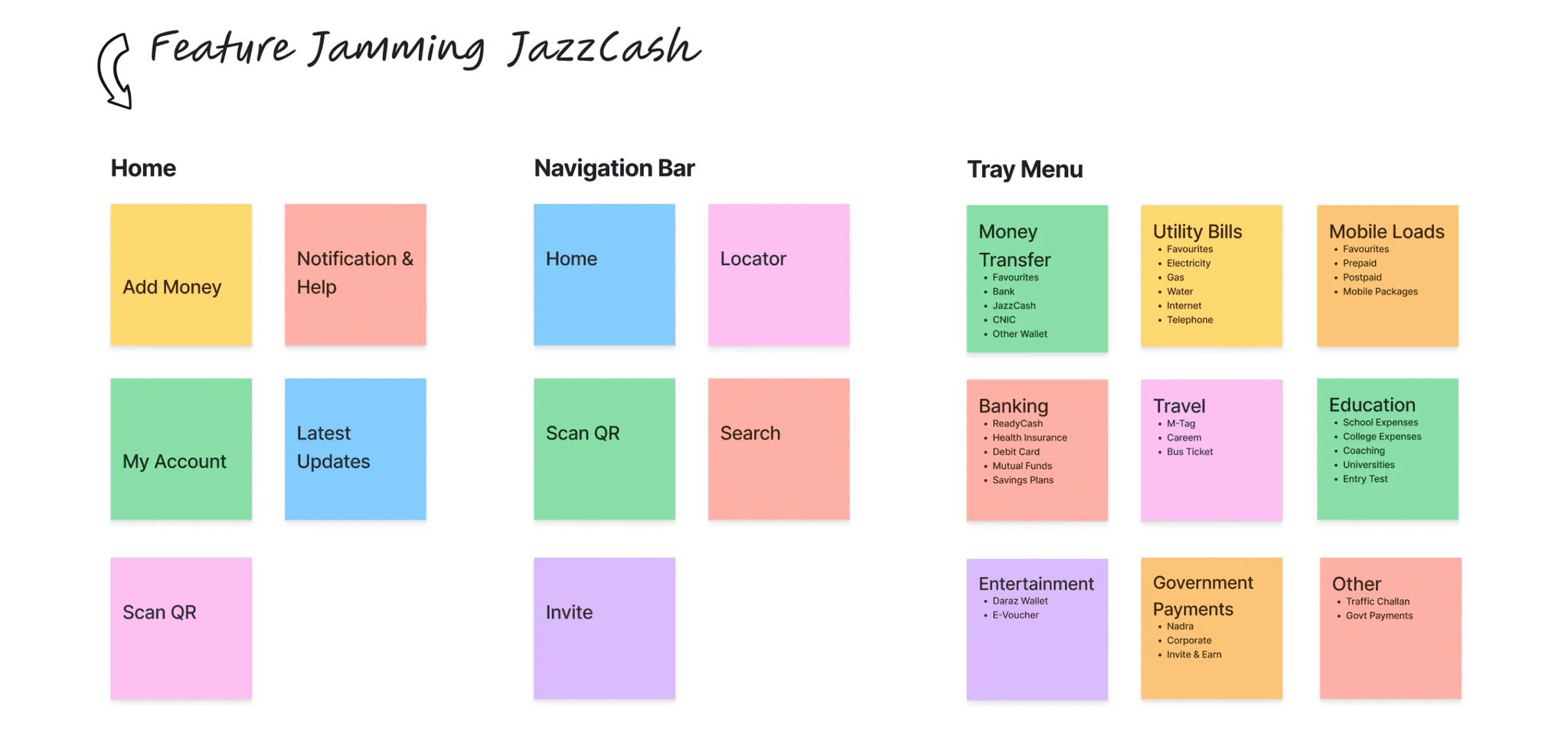
Features Jamming
Features Jamming
We conducted a collaborative feature jamming session to generate valuable features for the JazzCash app redesign, prioritizing user needs and preferences based on feedback and competitor analysis.
We conducted a collaborative feature jamming session to generate valuable features for the JazzCash app redesign, prioritizing user needs and preferences based on feedback and competitor analysis.
Connect to your bank account
Search
Chase
Bank of America
Wells Fargo
USAA
U.S. Bank
Navy Federal Credit Union
Wells Fargo
Wells Fargo
Wells Fargo
Wells Fargo
Wells Fargo
Wells Fargo

Skip This Step
9:41
LTE

The Wireframing
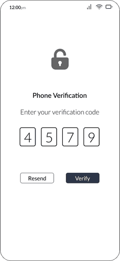
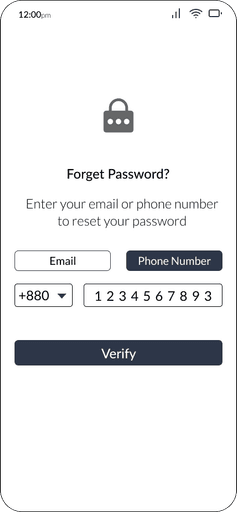
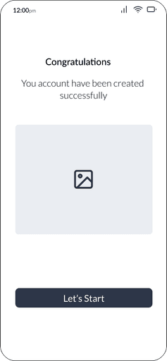
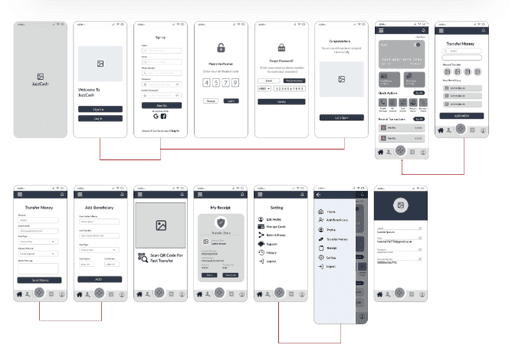
We started with low-fidelity wireframes to iterate on user flows, using paper prototypes for testing and feedback. Recognizing the importance of onboarding, we incorporated it into the wireframes.
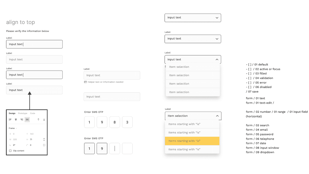
Design System
Design System
Colour Palette
Colour Palette
Typography
Typography
Elevation
Elevation
Layout Instructions
Layout Instructions
Input Field
Input Field
We conducted a collaborative feature jamming session to generate valuable features for the JazzCash app redesign, prioritizing user needs and preferences based on feedback and competitor analysis.
We conducted a collaborative feature jamming session to generate valuable features for the JazzCash app redesign, prioritizing user needs and preferences based on feedback and competitor analysis.


Connect to your bank account
Search
Chase
Bank of America
Wells Fargo
USAA
U.S. Bank
Navy Federal Credit Union
Wells Fargo
Wells Fargo
Wells Fargo
Wells Fargo
Wells Fargo
Wells Fargo
Skip This Step
9:41
LTE
UI Design
We started with low-fidelity wireframes to iterate on user flows, using paper prototypes for testing and feedback. Recognizing the importance of onboarding, we incorporated it into the wireframes.
We started with low-fidelity wireframes to iterate on user flows, using paper prototypes for testing and feedback. Recognizing the importance of onboarding, we incorporated it into the wireframes.
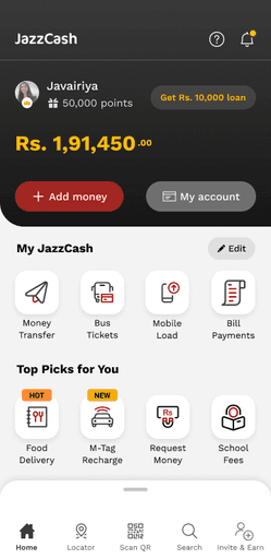
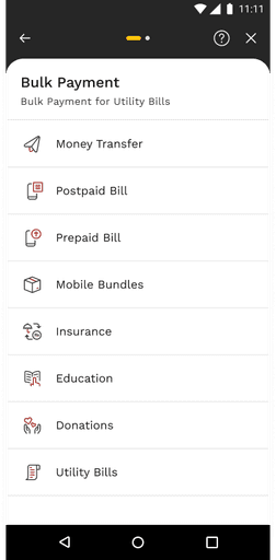
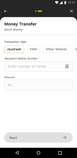
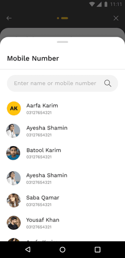
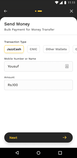
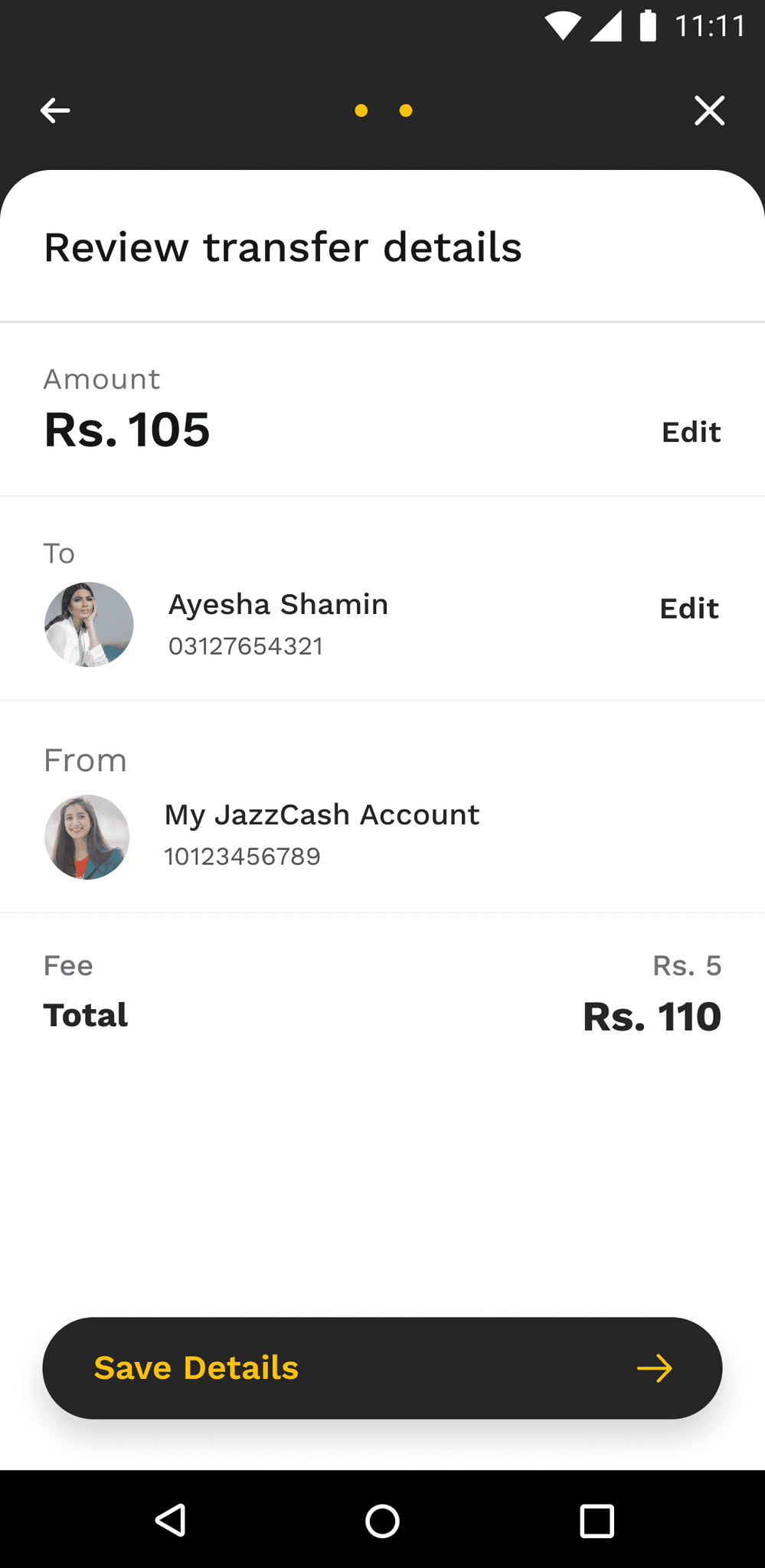
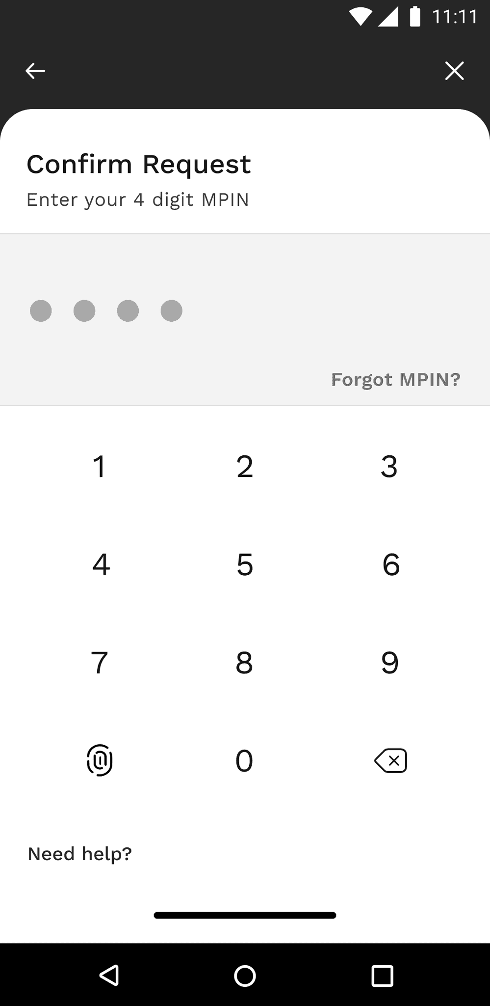
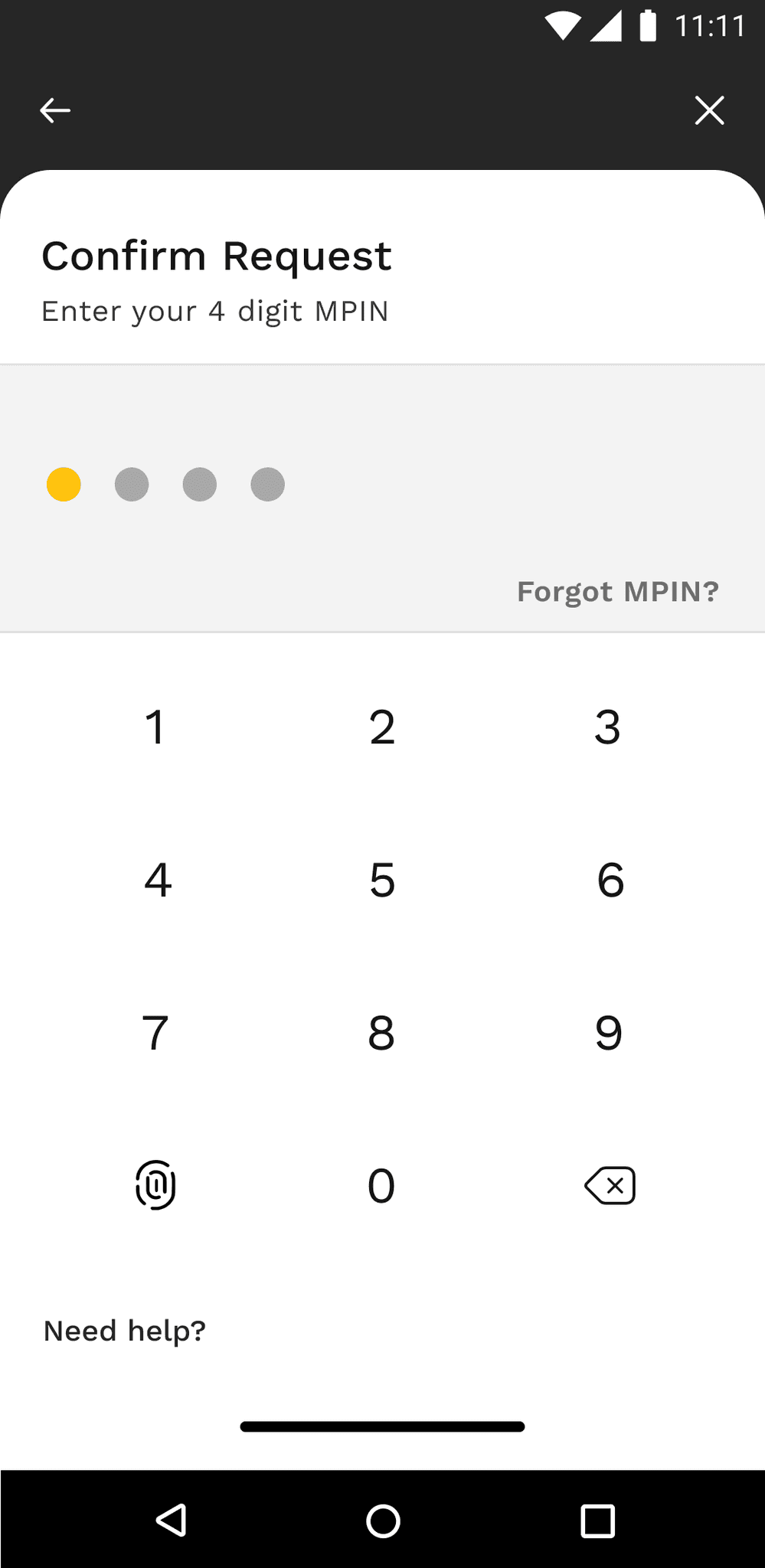
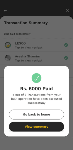
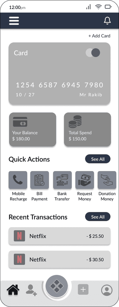
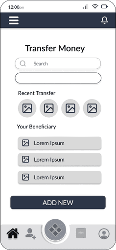
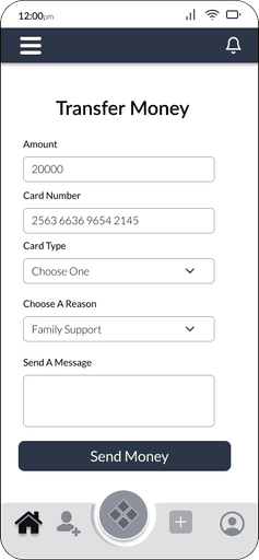
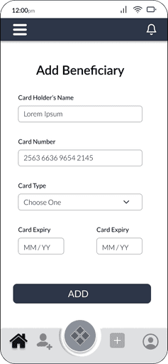
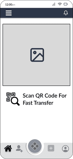
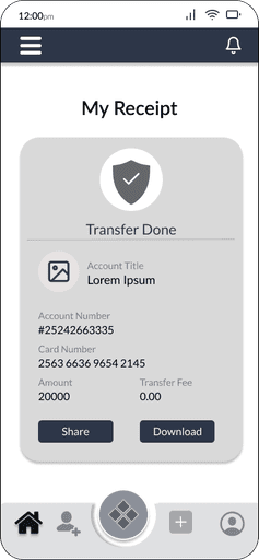
Money Transfer
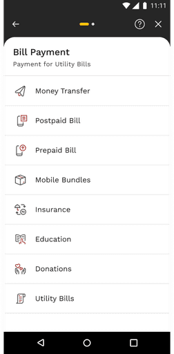
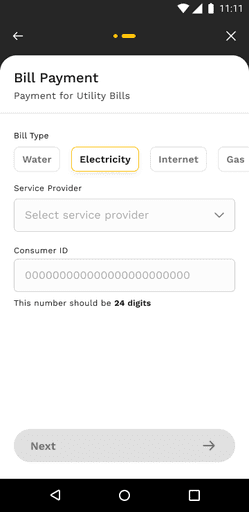
Bill Payment

UI Design
JazzCash-Pakistan’s leading mobile wallet
Some important insights
The JazzCash transformation project by IBM where I was a part of design team resulted in a significant boost in user adoption, surpassing expectations by increasing the user base from 18 million to over 43 million. The revamped design not only improved user satisfaction but also positioned JazzCash as a leader in the mobile financial services landscape by providing easiest flows.
1 year duration
UX Design
Visual design
Design System
5 Designers
“ Despite being the pioneer mobile wallet app introduced in Pakistan, JazzCash did not gain widespread adoption among the population. “
JazzCash was introduced in Pakistan in 2012, but it faced low user adoption. In 2020, IBM and Systems Limited took initiative to address this issue. They assembled a design team of five members, and I had the opportunity to be one of the designers on this team tasked with finding solutions.
Use Cases I have worked on
Money Transfer
->
Bulk Payment
->
M-tag
->
Entertainment
->
Design System
->
How we found out the problem ?

By empathising our users
Through different UX techniques we figured out the pain points of the users.
The target audience ?
There were three personas who of using
Old age people who can’t read and write
->
Tech-Savvy people
->
University going students
->

What people communicated on asking them their frustrations ?
We have conducted surveys with multiple users both consumers and merchants to find out their frustrations and painpoints
What they said? - some of the answers are below

To initiate the redesign process, we conducted extensive user research to gain valuable insights into the requirements, aspirations, and challenges faced by JazzCash users. Our research began with conducting user interviews and engaging with a diverse group of JazzCash users to understand their current usage of the app. We also conducted online surveys with a larger audience to gather valuable feedback
“The existing JazzCash app faced challenges related to usability and user adoption. The complex interface and lack of user-friendly features hindered the overall user experience. Additionally, catering to a diverse user base with varying digital literacy levels posed a significant challenge for the redesign process“
The research revealed that users found the current JazzCash interface too complex, causing serious usability issues that significantly hinder user engagement. Furthermore, it was discovered that a significant portion of the user base had low digital literacy levels, requiring special attention in the redesign.
The Problem Statement
Competitor of JazzCash

We conducted a competitive analysis to assess direct competitors, examining features, design patterns, and user flows. By comparing our offerings to competitors, we pinpointed strengths, areas for improvement, and opportunities. This guided the redesign of JazzCash, incorporating successful design elements and features identified during the analysis
Strengths
Enhanced search functionality
Prominent "Add Cash" Call-to-Action (CTA)
Upfront display of available balance
Dropdown menu to select network for mobile top-up
Convenient one-click account hiding option
QR code scanning and sharing for hassle-free money transfers
->
->
->
->
->
->
Streamlined and Secure sign-in process
->
QR code scanning and sharing for hassle-free money transfers
->
Connect to your bank account
Search
Chase
Bank of America
Wells Fargo
USAA
U.S. Bank
Navy Federal Credit Union
Wells Fargo
Wells Fargo
Wells Fargo
Wells Fargo
Wells Fargo
Wells Fargo
Skip This Step
9:41
LTE
The Wireframing
We started with low-fidelity wireframes to iterate on user flows, using paper prototypes for testing and feedback. Recognizing the importance of onboarding, we incorporated it into the wireframes.
JazzCash-Pakistan’s leading mobile wallet
The JazzCash transformation project by IBM where I was a part of design team resulted in a significant boost in user adoption, surpassing expectations by increasing the user base from 18 million to over 43 million. The revamped design not only improved user satisfaction but also positioned JazzCash as a leader in the mobile financial services landscape by providing easiest flows.
Some important insights
1 year duration
UX Design
Visual design
Design System
5 Designers
JazzCash-Pakistan’s leading mobile wallet
Some important insights
The JazzCash transformation project by IBM where I was a part of design team resulted in a significant boost in user adoption, surpassing expectations by increasing the user base from 18 million to over 43 million. The revamped design not only improved user satisfaction but also positioned JazzCash as a leader in the mobile financial services landscape by providing easiest flows.
Design System
1 year duration
UX Design
Visual Design
5 Designers

“ Despite being the pioneer mobile wallet app introduced in Pakistan, JazzCash did not gain widespread adoption among the population. “
JazzCash was introduced in Pakistan in 2012, but it faced low user adoption. In 2020, IBM and Systems Limited took initiative to address this issue. They assembled a design team of five members, and I had the opportunity to be one of the designers on this team tasked with finding solutions.
Use Cases I have worked on
Money Transfer
->
Bulk Payment
->
M-tag
->
Entertainment
->
Design System
->
How we found out the problem ?
What users says ?
30%
What are the
frustrations of the users?

Empathising our users
Through different UX techniques we figured out the pain points of the users.
The target audience ?
->
Tech-Savvy people
->
University going students
->
There were three personas who of using
Old age people who can’t read and write
->
Tech-Savvy people
->
University going students
->
The target audience ?

The target audience ?
->
Tech-Savvy people
->
University going students
->
We have conducted surveys with multiple users both consumers and merchants to find out their frustrations and painpoints
What people communicated on asking them their frustrations ?
What they said? - some of the answers are below
To initiate the redesign process, we conducted extensive user research to gain valuable insights into the requirements, aspirations, and challenges faced by JazzCash users. Our research began with conducting user interviews and engaging with a diverse group of JazzCash users to understand their current usage of the app. We also conducted online surveys with a larger audience to gather valuable feedback
The target audience ?
->
Tech-Savvy people
->
University going students
->
“The existing JazzCash app faced challenges related to usability and user adoption. The complex interface and lack of user-friendly features hindered the overall user experience. Additionally, catering to a diverse user base with varying digital literacy levels posed a significant challenge for the redesign process“
The problem Statement
The research revealed that users found the current JazzCash interface too complex, causing serious usability issues that significantly hinder user engagement. Furthermore, it was discovered that a significant portion of the user base had low digital literacy levels, requiring special attention in the redesign.
Competitors of JazzCash
We conducted a competitive analysis to assess direct competitors, examining features, design patterns, and user flows. By comparing our offerings to competitors, we pinpointed strengths, areas for improvement, and opportunities. This guided the redesign of JazzCash, incorporating successful design elements and features identified during the analysis
Strengths
Enhanced search functionality
->
Prominent "Add Cash" Call-to-Action (CTA)
->
Upfront display of available balance
->
Dropdown menu to select network for mobile top-up
->
Convenient one-click account hiding option
->
QR code scanning and sharing for hassle-free money transfers
->
Streamlined and Secure sign-in process
->
Weaknesses
The icon used for cash points in EasyPaisa resembles a location icon, leading to confusion among users
Important promotional banners are positioned at the bottom of the interface, requiring excessive scrolling and potentially resulting in users overlooking valuable promotions.
Absence of notifications feature
Limited number of features offered by Finca, providing only four functionalities
->
->
->
->
->
Lack of a feature to locate nearby Finca merchants, which could assist users in withdrawing cash from their Finca accounts
Utilizes a conventional and consistent language tone.
->
Clear and easily understandable language used throughout.
->
Incorporates a mix of graphical images and human-generated visuals to enhance engagement and comprehension.
->
Content
Features Jamming
We conducted a collaborative feature jamming session to generate valuable features for the JazzCash app redesign, prioritizing user needs and preferences based on feedback and competitor analysis.
Connect to your bank account
Search
Chase
Bank of America
Wells Fargo
USAA
U.S. Bank
Navy Federal Credit Union
Wells Fargo
Wells Fargo
Wells Fargo
Wells Fargo
Wells Fargo
Wells Fargo
Skip This Step
9:41
LTE
The Wireframing
We started with low-fidelity wireframes to iterate on user flows, using paper prototypes for testing and feedback. Recognizing the importance of onboarding, we incorporated it into the wireframes.

Connect to your bank account
Search
Chase
Bank of America
Wells Fargo
USAA
U.S. Bank
Navy Federal Credit Union
Wells Fargo
Wells Fargo
Wells Fargo
Wells Fargo
Wells Fargo
Wells Fargo
Skip This Step
9:41
LTE
Design System
Colour Palette
Typography
Elevation
Layout Instructions
Input Field
We conducted a collaborative feature jamming session to generate valuable features for the JazzCash app redesign, prioritizing user needs and preferences based on feedback and competitor analysis.
Connect to your bank account
Search
Chase
Bank of America
Wells Fargo
USAA
U.S. Bank
Navy Federal Credit Union
Wells Fargo
Wells Fargo
Wells Fargo
Wells Fargo
Wells Fargo
Wells Fargo
Skip This Step
9:41
LTE
The Wireframing
Money Transfer
Bill Payment
We started with low-fidelity wireframes to iterate on user flows, using paper prototypes for testing and feedback. Recognizing the importance of onboarding, we incorporated it into the wireframes.
The flows within the application are well-designed and intuitive.
->
Filters are not utilized in the application, making it difficult to refine search results or narrow down options.
->
The representation of features is not appropriately prioritized, causing confusion or a lack of clarity.
->
UX
Design
Colors are not properly separated, and there is too much green (primary color) in the design.
->
The design doesn't feel crowded or messy.
->
The different feature categories are represented well and are easy to understand.
->