FundFinder : Simplifying Mutual Fund Investments
FundFinder : Simplifying Mutual Fund Investments
Mobile App • Mutual Funds • Fintech • Design Process • Customer Journey Mapping • Wireframes • UI Design • Usability Testing
In 2021, Systems Ltd collaborated with a KASB bank in Pakistan to create a mutual funds platform. The project aimed to develop an app from scratch, simplifying the fund selection process for users by consolidating information and eliminating the need for multiple applications. Key stages included UX research, persona development, customer journey mapping, wireframing, UI design, and usability testing.
MY ROLE : UX Researcher, UI Designer
TOOLS : Figma, Miro
TIMELINE : 3 Months (2 Months - UX Research, 1 Month - UI Design)
FundFinder : Simplifying Mutual Fund Investments
Mobile App • Mutual Funds • Fintech • Design Process
• Customer Journey Mapping • Wireframes • UI Design
• Usability Testing
In 2021, Systems Ltd collaborated with a KASB bank in Pakistan to create a mutual funds platform. The project aimed to develop an app from scratch, simplifying the fund selection process for users by consolidating information and eliminating the need for multiple applications. Key stages included UX research, persona development, customer journey mapping, wireframing, UI design, and usability testing.
MY ROLE : UX Researcher, UI Designer
TOOLS : Figma, Miro
TIMELINE : 3 Months (2 Months - UX Research, 1 Month - UI Design)
Target Audience
Target Audience
Target Audience
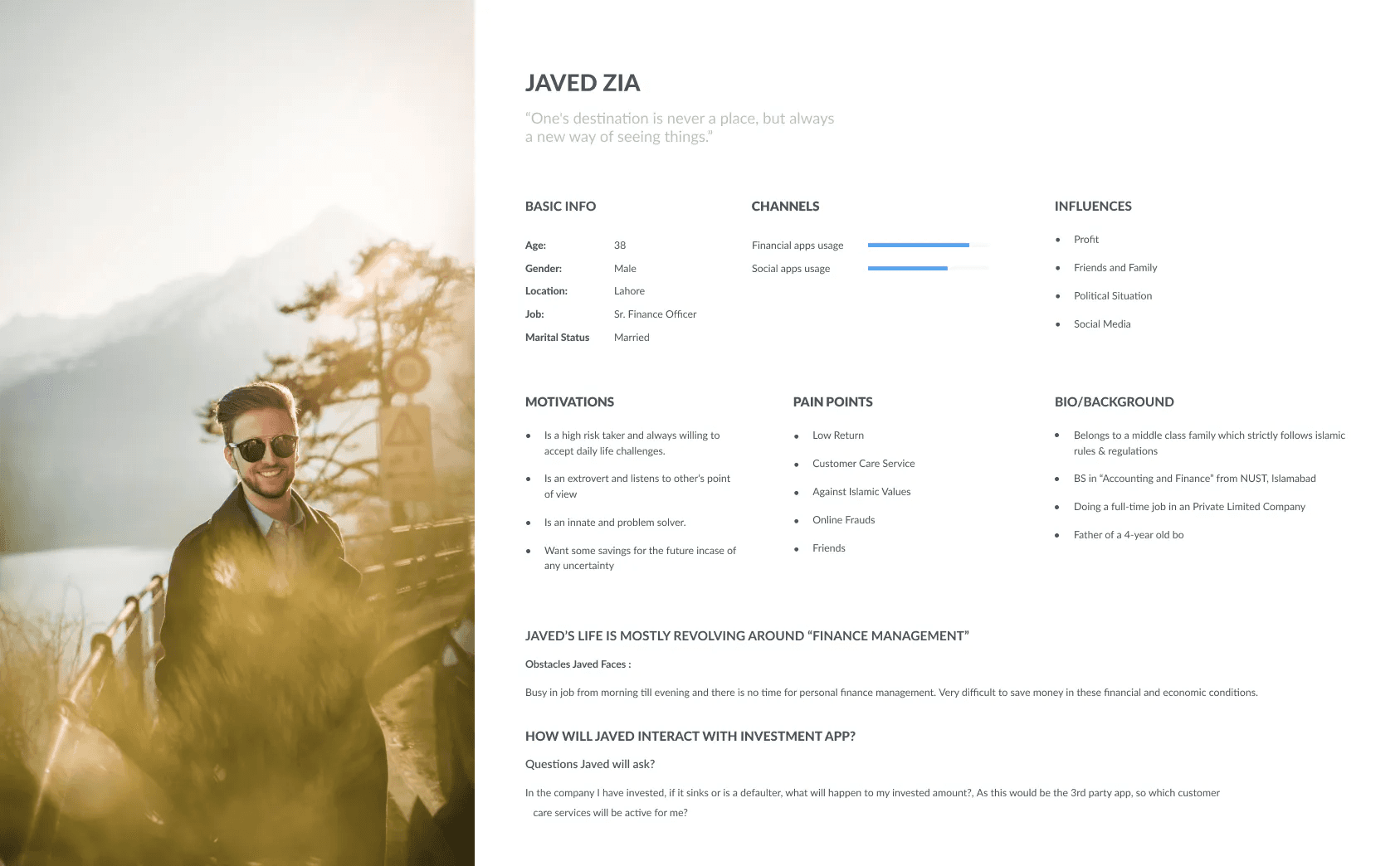
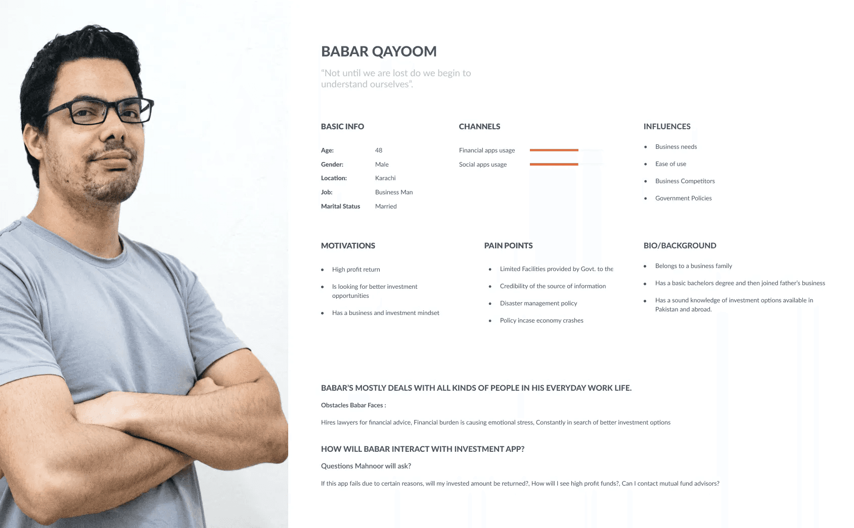
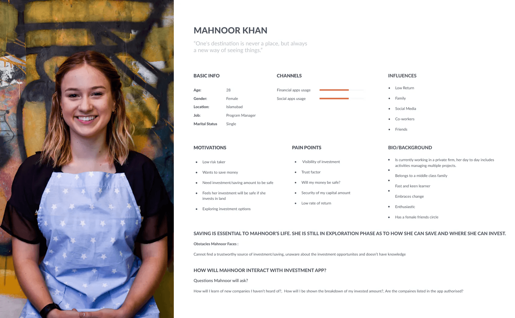
To guide our design process, we developed user personas for our target audience: Upper Tier (risk-takers), Lower Tier (risk-averse individuals), and Businessmen (experienced investors). These personas, based on investor types, age groups, and professions, provided insights into preferences, behaviors, and goals. This understanding allowed us to tailor our design decisions to meet specific user requirements.
To guide our design process, we developed user personas for our target audience: Upper Tier (risk-takers), Lower Tier (risk-averse individuals), and Businessmen (experienced investors). These personas, based on investor types, age groups, and professions, provided insights into preferences, behaviors, and goals. This understanding allowed us to tailor our design decisions to meet specific user requirements.
To guide our design process, we developed user personas for our target audience: Upper Tier (risk-takers), Lower Tier (risk-averse individuals), and Businessmen (experienced investors). These personas, based on investor types, age groups, and professions, provided insights into preferences, behaviors, and goals. This understanding allowed us to tailor our design decisions to meet specific user requirements.
“ To simplify the fragmented and complex experience of mutual fund investments, our goal was to create a single application consolidating various fund organisations. This streamlined approach aims to provide investors with an efficient and user-friendly platform, addressing challenges associated with using multiple applications. “
“ To simplify the fragmented and complex experience of mutual fund investments, our goal was to create a single application consolidating various fund organisations. This streamlined approach aims to provide investors with an efficient and user-friendly platform, addressing challenges associated with using multiple applications. “
Features of FundFinder
Features of FundFinder
Features of FundFinder
Sign In: Secure and convenient user sign-in
Sign In: Secure and convenient user sign-in
Dashboard: Overview of the user's investment portfolio, savings goals, and features
Dashboard: Overview of the user's investment portfolio, savings goals, and features
Invest in Mutual Funds: Explore, compare, and invest in diverse funds.
Invest in Mutual Funds: Explore, compare, and invest in diverse funds.
Invite Friends: Users can invite friends, potentially earning referral benefits.
Invite Friends: Users can invite friends, potentially earning referral benefits.
Saving Goals: Set and track financial objectives.
Saving Goals: Set and track financial objectives.
Investor Guide: Educational resources for informed investment decisions.
Investor Guide: Educational resources for informed investment decisions.
Talk to Financial Experts: Access to personalized advice.
Talk to Financial Experts: Access to personalized advice.
Current Market Updates: Real-time insights about the mutual fund market.
Current Market Updates: Real-time insights about the mutual fund market.
Finance Calculator: Tool for calculating returns, investment amounts, etc.
Finance Calculator: Tool for calculating returns, investment amounts, etc.
Customer Journey Map
Customer Journey Map
Customer Journey Map
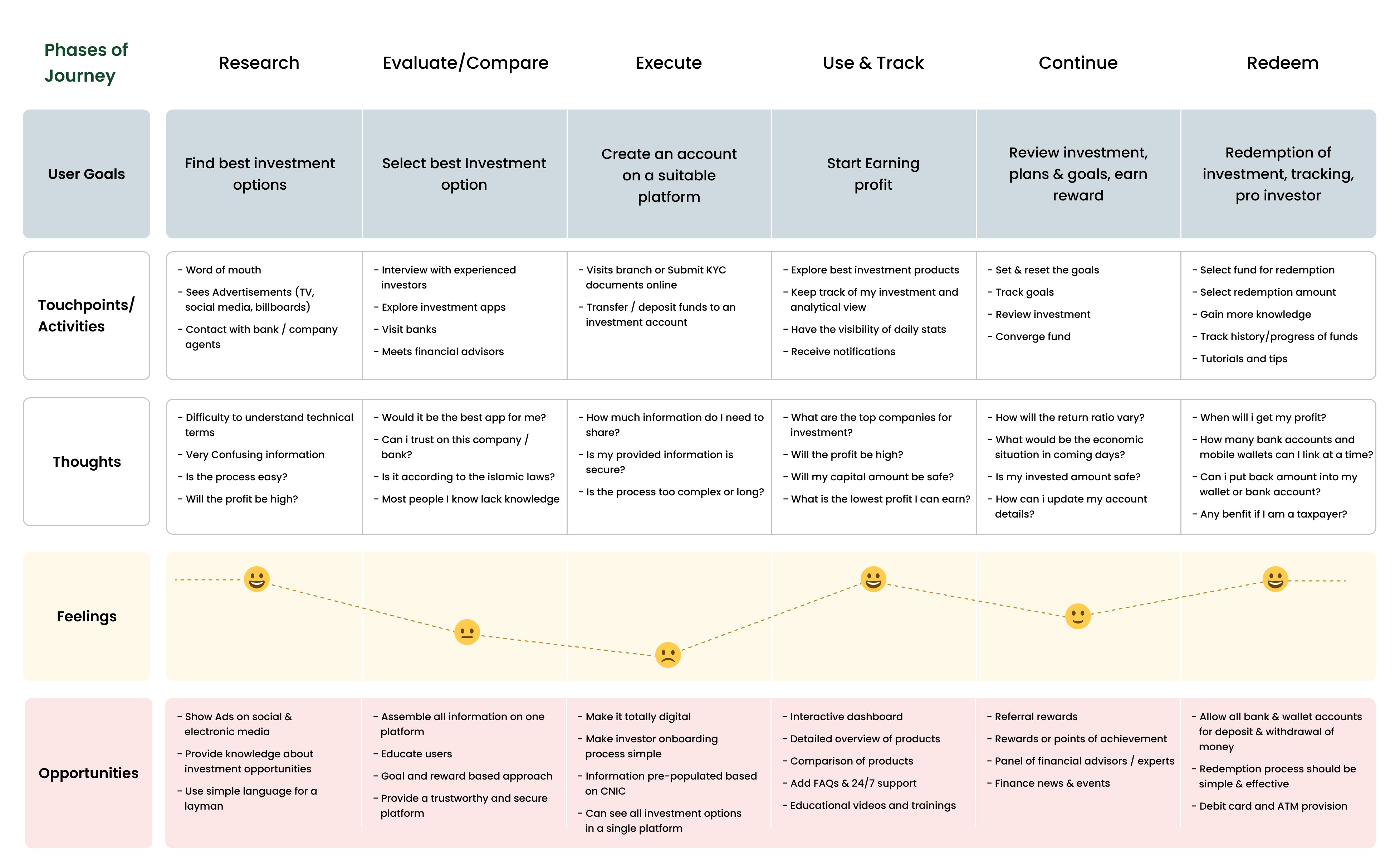
After gathering user requirements, we organized findings into a customer journey map, categorizing insights into push and pull factors. This identified fundamental user needs for FundFinder's UX design, uncovering pain points and emotional expectations. Mapping touchpoints and pain points helped bridge knowledge gaps, manage expectations, and streamline the design flow by defining inclusions and omissions.
After gathering user requirements, we organized findings into a customer journey map, categorizing insights into push and pull factors. This identified fundamental user needs for FundFinder's UX design, uncovering pain points and emotional expectations. Mapping touchpoints and pain points helped bridge knowledge gaps, manage expectations, and streamline the design flow by defining inclusions and omissions.
After gathering user requirements, we organized findings into a customer journey map, categorizing insights into push and pull factors. This identified fundamental user needs for FundFinder's UX design, uncovering pain points and emotional expectations. Mapping touchpoints and pain points helped bridge knowledge gaps, manage expectations, and streamline the design flow by defining inclusions and omissions.
User Flow
User Flow
User Flow
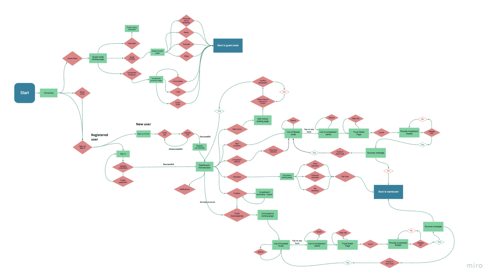
“ Using insights from research and journey mapping, we refined FundFinder's user flow, prioritizing a streamlined design for efficiency. We identified main sections, established connected flows, and crafted user flows for each section, ensuring a cohesive and user-friendly experience. This sets the foundation for a seamless journey within FundFinder. “
“ Using insights from research and journey mapping, we refined FundFinder's user flow, prioritizing a streamlined design for efficiency. We identified main sections, established connected flows, and crafted user flows for each section, ensuring a cohesive and user-friendly experience. This sets the foundation for a seamless journey within FundFinder. “
Wireframing
Wireframing
Wireframing
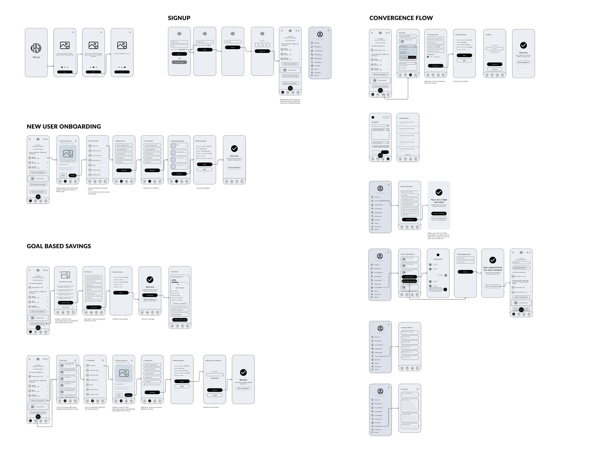
After finalizing features and flows, we created low-fidelity wireframes using Figma to transform the user flow into visual screens. These wireframes provided a tangible representation, visualizing the user interface and interactions for the FundFinder application.
After finalizing features and flows, we created low-fidelity wireframes using Figma to transform the user flow into visual screens. These wireframes provided a tangible representation, visualizing the user interface and interactions for the FundFinder application.
After finalizing features and flows, we created low-fidelity wireframes using Figma to transform the user flow into visual screens. These wireframes provided a tangible representation, visualizing the user interface and interactions for the FundFinder application.
Style Board
Style Board
Style Board
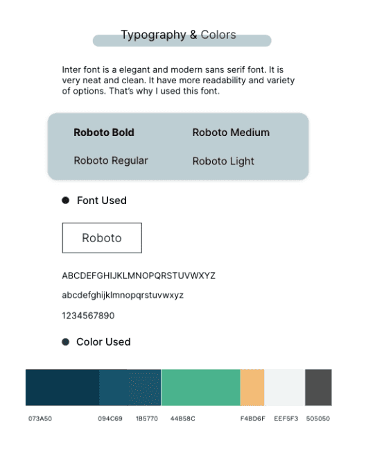
To define the visual elements like colors, typography, buttons, and padding, we collaborated with stakeholders and researched current design trends. This ensured our style board aligned with the desired aesthetic and met both project and audience expectations.
To define the visual elements like colors, typography, buttons, and padding, we collaborated with stakeholders and researched current design trends. This ensured our style board aligned with the desired aesthetic and met both project and audience expectations.
To define the visual elements like colors, typography, buttons, and padding, we collaborated with stakeholders and researched current design trends. This ensured our style board aligned with the desired aesthetic and met both project and audience expectations.
UI Design
UI Design
UI Design
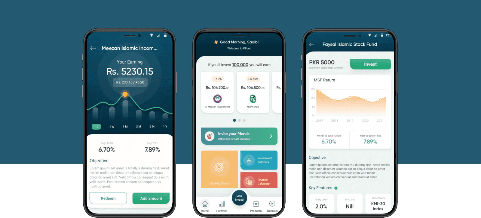
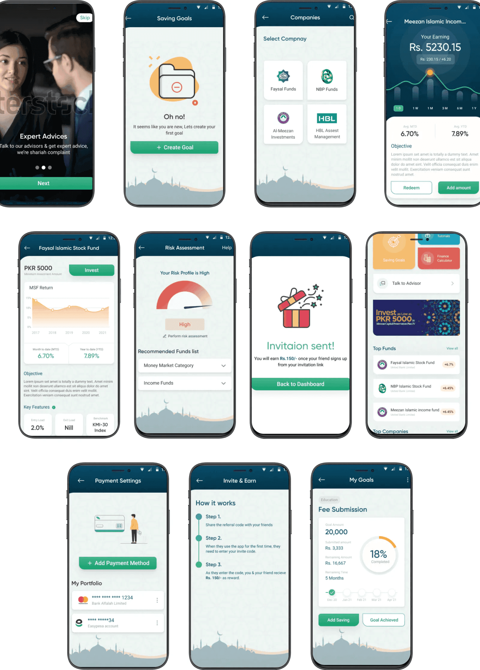
We transformed wireframes into a polished final design by incorporating UI elements. Building on the style board, we selected colors, typography, icons, and buttons for a cohesive and engaging user interface. This step brought the wireframes to life, ensuring the final design meets functional requirements while delivering a visually pleasing and user-friendly experience.
We transformed wireframes into a polished final design by incorporating UI elements. Building on the style board, we selected colors, typography, icons, and buttons for a cohesive and engaging user interface. This step brought the wireframes to life, ensuring the final design meets functional requirements while delivering a visually pleasing and user-friendly experience.
We transformed wireframes into a polished final design by incorporating UI elements. Building on the style board, we selected colors, typography, icons, and buttons for a cohesive and engaging user interface. This step brought the wireframes to life, ensuring the final design meets functional requirements while delivering a visually pleasing and user-friendly experience.
The Usability Testing
The Usability Testing
The Usability Testing
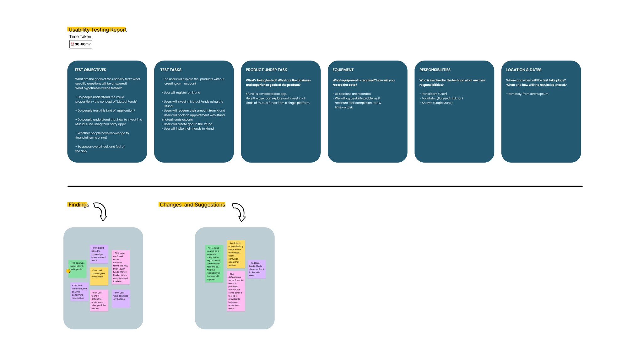
We tested our design with 5 experienced investment app users to assess usability. The feedback highlighted areas of improvement, allowing us to refine the design for simplicity and user-friendliness, aligning it with our target users' expectations.
We tested our design with 5 experienced investment app users to assess usability. The feedback highlighted areas of improvement, allowing us to refine the design for simplicity and user-friendliness, aligning it with our target users' expectations.
We tested our design with 5 experienced investment app users to assess usability. The feedback highlighted areas of improvement, allowing us to refine the design for simplicity and user-friendliness, aligning it with our target users' expectations.
